Time to read: 7 min
You’ve worked for months to get your prototype functioning. It’s time to take that ugly (but functional!) works-like prototype and create a real consumer product. Right now, you may be focused on the general shape, smoothing out the curves and accommodating the awkward PCB shape (darn those electrical engineers!), but soon you’ll feel the need for control—controls, that is, and buttons that look better than the DigiKey panel mount you’ve been using.
Intro to Button Design
(For toggle design, you’ll want to go down the hall to Mrs. Wilkes’ sewing class.)
As always, first things first: How will this be used? Where is it on the machine? Will the user be pressing the button with their thumb or finger?
And what about the indicated use: Is this a simple “press and do” button, or does it indicate an up-down level, like volume?
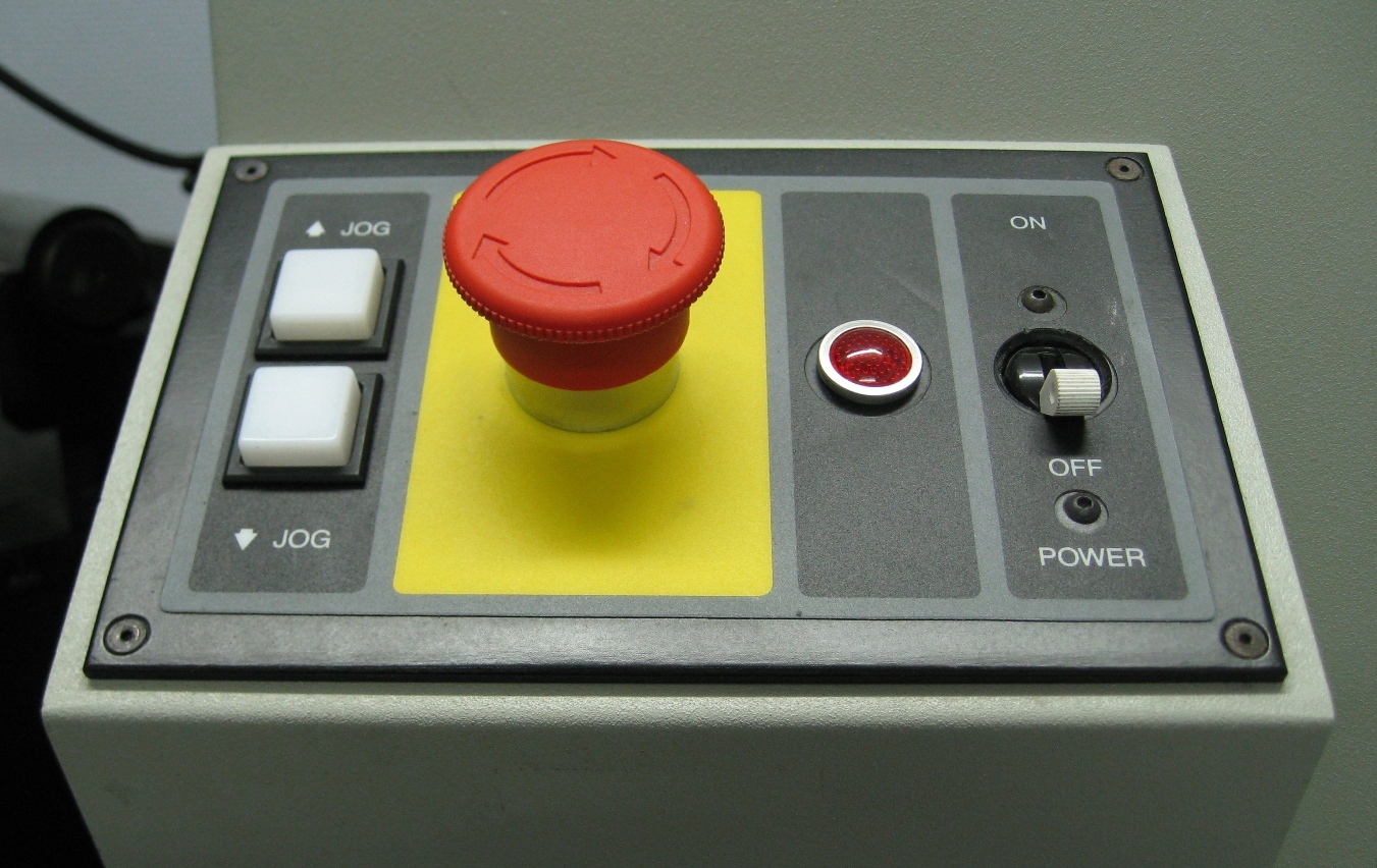
Buttons are a chance for both comfortable ergonomics and increased intuition in your product design. Large buttons surrounded by smaller ones indicate relative importance. A volume rocker button indicates a level going up and down. A single big red button says, “PANIC.”
On a (literally) deeper level, you’ll need to think about the interior of the case, too. Your button may look pretty on the outside, but on the inside, you’ll need to align it with the PCB-mounted or panel-mounted electronic switch (being sure to check tolerances) and think about depth of throw and potential force. And then there’s the internal wiring—be careful that the wires are out of the way inside.
So much to think about! Let’s dive right in.
Integrating Springs: Cantilever Design
For most external buttons, the design will call for some type of mechanical spring to augment the one on the electronics component, and one of the most common ways to do this is with a plastic cantilever. The cantilever spring is a small finger of plastic that extends from the main body, flexing with each press, and pulling the button back to its rest position afterwards. There are two things to consider in cantilever design: strength and fatigue.
This is (roughly) what the drawings should look like:
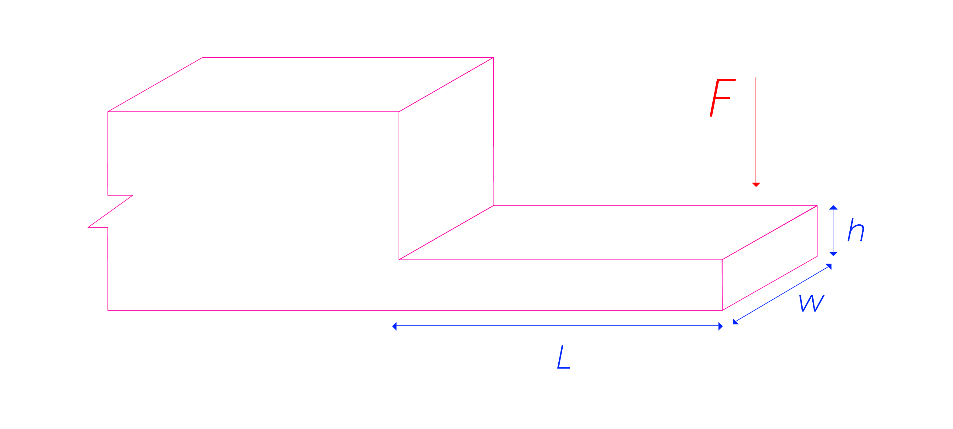
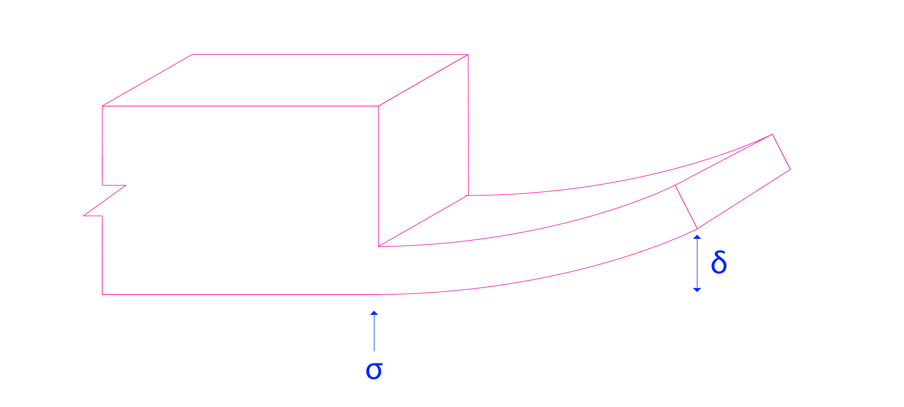
In designing a cantilever button spring, first determine the depth of “throw”—that is, how much flex you’ll need from the button.
That press depth becomes the desired maximum deflection, δ. How hard the user presses is the required force, F. Look up your material properties to determine the modulus of elasticity, E.
With these factors determined, you can play with the other geometry as required for the length (L), width (or base, b), and thickness (or height, h), to balance out this equation:

(rectangular cross-section only)
Overall, longer is better to reduce fatigue, the second part of the design to check. You don’t want a single-use button, and if your plastic cantilever-beam-cum-spring is bent too far, it’s going to snap more quickly than an office worker with a red Swingline stapler. You may remember from your Strength of Materials 101 class that the stress on a cantilever beam is highest at the origin, or in this case, where the material thickens stepwise.
The stress (?) at a cantilever beam origin can be calculated as:

Maximum stress for your material will tell you how far it can go before breaking, but for a spring like this, it’s important to stay well below that in the elastic region of the stress-strain diagram. This will vary widely from material to material, but as a general rule, you’ll want to ensure that your maximum stress is no more than 20 MPa for the toughest printed materials.
Because a printed spring like this requires high elasticity, the best materials for this kind of design are ABS, ABS-like and Nylon (see below for more information on each material).
Mounting and Alternative Springs
Buttons with integrated springs can either be mounted with a sliding mount, where the button is suspended between the two springs in the case, and the springs slide against their mounts, or by fixing the end of the cantilever to the housing with screws or heat stakes. Of course, when prototyping with 3D printing, you have options you won’t have with an injection molded design—essentially, any shape can be made without worrying about molding angles—so you can actually have the button printed as part of the case. Printing magic, baby!
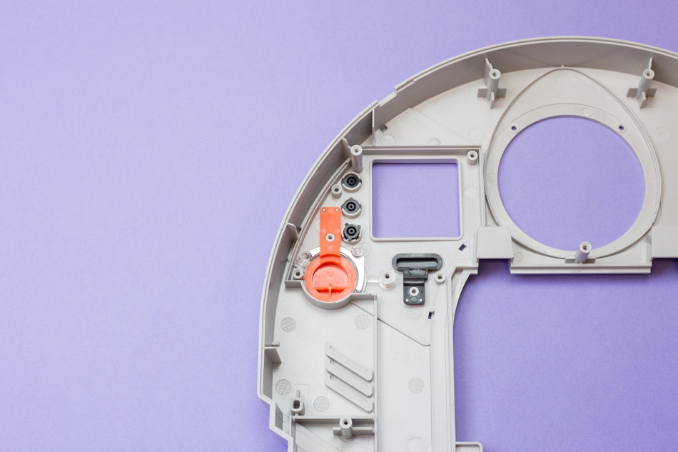
As an alternative to these unified designs, a rubber backing piece can be used as a spring. Typically, this is used in places where the plastic springs are impractical, due to button spacing, or when a large number of buttons is in a pad, like on a remote control.
A sheet with a series of rounded bumps can be printed, using the rubber-like material, and used as a backing spring for an entire control panel of buttons, freeing the shapes of the buttons from any required spring mounts.
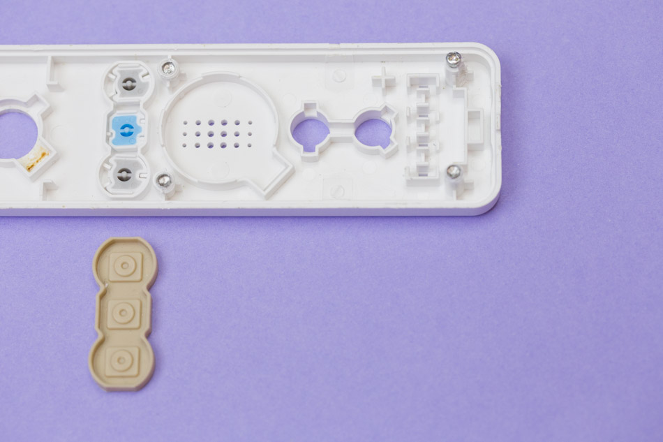
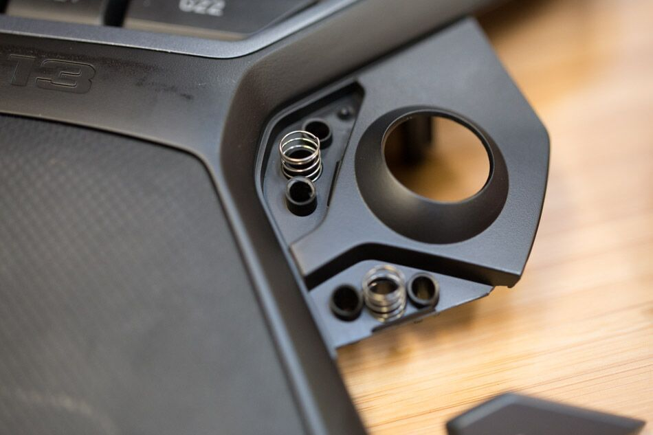
Of course, in looking for springs, a regular coil spring can be used beneath the button. This is ideal for situations with very deep press, such as a blender control panel. Long or deep-throw buttons like this indicate very deliberate action and keep the user from accidentally activating the switch.
Types of Buttons and Sample Designs
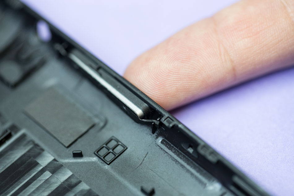
Volume Rocker
Great for volume buttons (or any level that increases and decreases in opposition), this two-point button is a standard for most tablets and phones. Using a two-cantilever sliding design allows for each cantilever to act as a fulcrum, while the other side acts as a spring.
Directional Pads
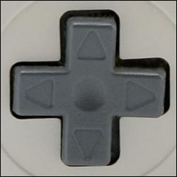
A staple of video game controls, the D-pad also commonly shows up in TV remotes and other consumer electronics. It clearly contrasts two different dimensions, keeping users from trying to move a character up-left and back-right simultaneously, or a channel higher and lower at the same time (unless two siblings are fighting between “Game of Thrones” and “The Walking Dead”. May we never face such a dilemma.).
The best design for this situation is a more complicated variation of the sliding cantilever, with a single plastic spring extending from each pad into a sliding mount. Alternatively, with a slightly softer feel, a rubber pad can be placed under all four with similar effect.
Panel Switch
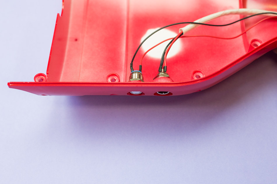
When you really have to use the off-the-shelf part, I suggest hiding a panel mount switch in a recessed area of the electronics enclosure, to retain a sleek, consumer-oriented feel.
Thumb Buttons
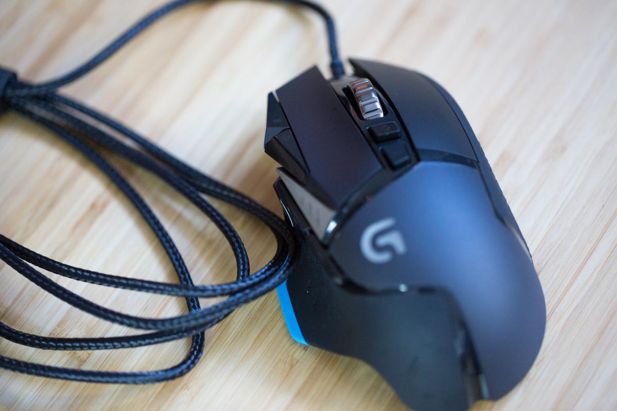
In places where the hand is fixed in relation to the device, like in an ergonomic mouse, a thumb button will often take more of a beating with hard stress presses. The thumb button is an opportunity for better ergonomics, recessing the button into a thumb-shaped indentation and providing a larger button area. Mechanically, the strength of a screw-mounted cantilever gives the solidity this type of button requires, and multiple attachment points can be used for a more solid press.
Triggers
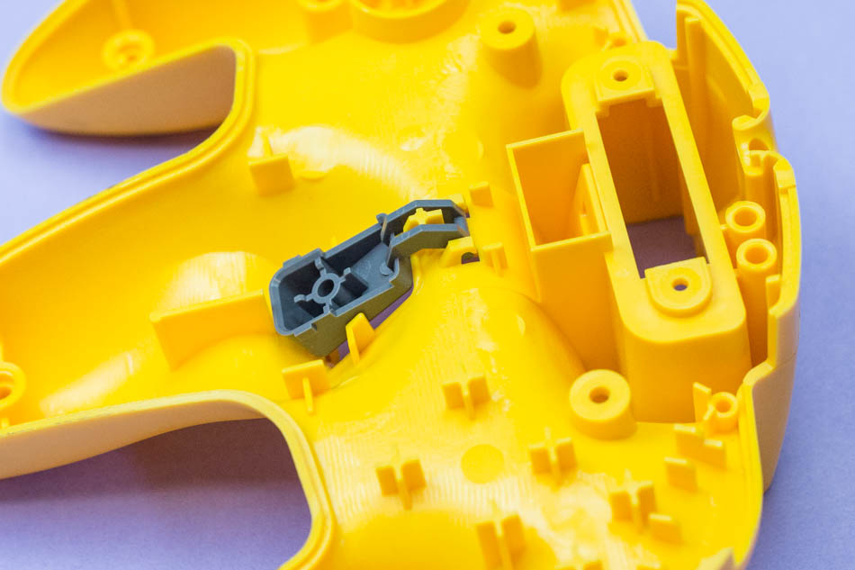
Another game controller standard, the trigger button should be easily felt and have a long throw. This unusual button is often hidden away out of sight, so it needs to be simple to identify by touch. The long throw can be accomplished with a rotating mount and either a torsion spring or coil spring for return.
Aesthetics of Design
Buttons are often, well, button-shaped, like their clothes-fastening cousins. Explore further, and use the control as an opportunity for an exclamation point in the design. Try using a contrasting color for the button: a bright silver in an otherwise black enclosure, or bright green in an orange case. Experiment!
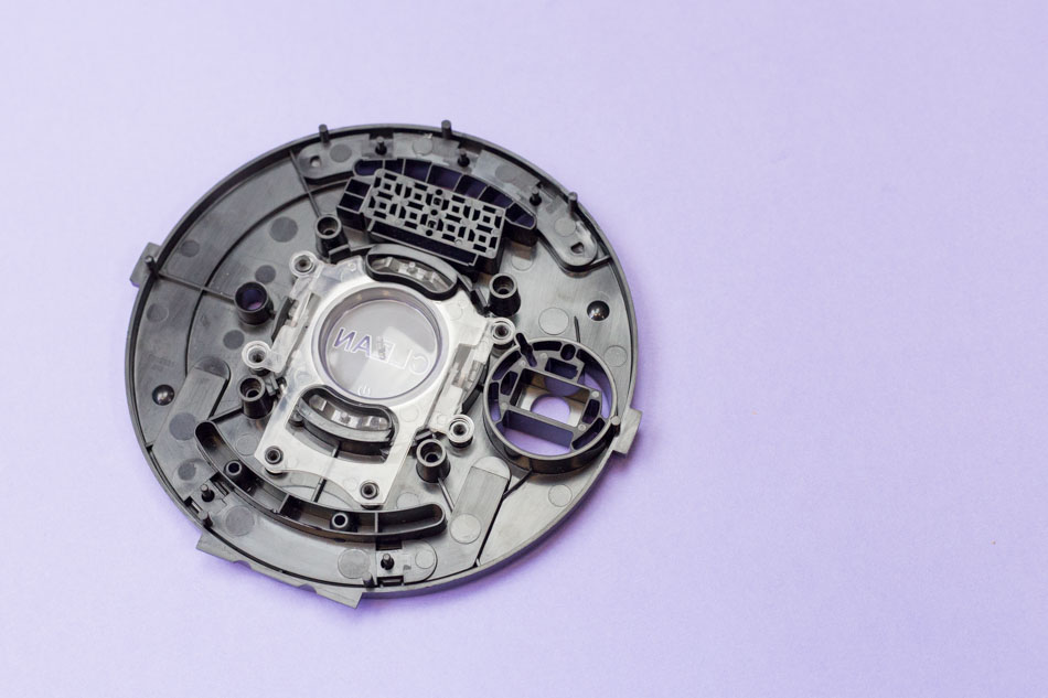
More unusually, you can also use the button as a window into the design with translucent materials. This can allow the buttons to glow, for easy use of the device in the dark (like a light pipe), or it can simply allow some of the electronics to be seen in designs showing off their technical aspects. Try the transparent material for prototyping and an acrylic or polycarbonate in production.
Prototyping Your Design
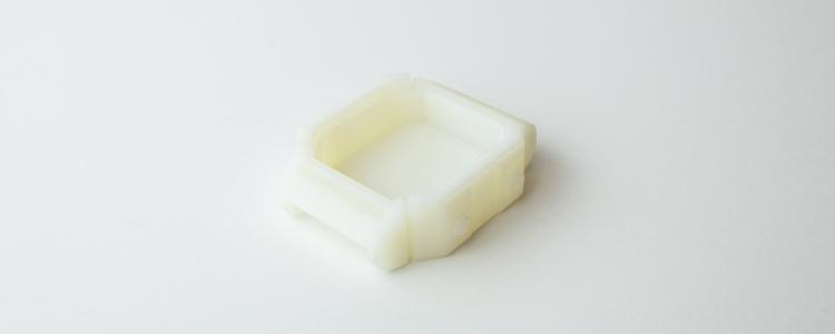
For incorporated springs, there are three strong material options for prototyping: ABS, Nylon, and ABS-like.
ABS is actual ABS material, but extruded into thin threads, then printed in fused layers. Because the tightest resolution is the thickness of these thin threads, the material is somewhat coarse, and is best for thicker cantilever springs.
Nylon is somewhat finer, and is suitable for medium thickness springs.
ABS-like is the best choice for any cantilever spring, but more expensive, and so is best saved for late-stage prototypes where a more polished appearance is valued.
When testing, keep in mind that materials behave differently when a different manufacturing process is used, such as fused deposition modeling (FDM) or selective laser sintering (SLS). A 3D-printed spring won’t have quite the toughness of your final design, so it can’t be used for fatigue limit testing.
The elasticity and strength will vary, as well, so be sure to look at the material data sheets. However, as a first approximation, the printed buttons and mounts are ideal. Also, if you compare the modulus of elasticity of the printed material to your final manufactured material, you can use that to scale the equations above and determine how much force will be needed for your final button to activate.
Final Thoughts
At the triple intersection between aesthetics, ergonomics and functionality, button controls provide an amazing opportunity to creatively showcase great industrial design. Take the opportunity in your next product design to experiment with unusual shapes, colors, and even textures.
Industrial design is about interaction, the relationship between human and machine, and for many products, that interaction is most intimate where the user reaches out to touch the design: the buttons.
Want more info about what Fictiv can offer you? Check out our Capabilities Guide.
